A blog devoted to all my media A level coursework, here i will show you the steps that I will go through to produce my Music Magazine, just make sure you follow my steps so you dont get lost along the way..
Music Magazine Flat Plans Computer generated
These are my re-created flat plans, these are more detailed designs and are clearer than the draft designs that drew. I hope this shows a better understanding of what I'm hoping to achieve by looking at the following drafts below of the Front Cover, Contents and Double Page.
Music Magazine Flat Plans
Here are my flat plans, as you can see they are rough and my artistsic skills arent to the highest of qualities but here you go.
Front Cover
On the front cover I wanted it to be detailed and have a lot
going on, but I wanted to ensure that my main artist still made a presence on
the page as a bold and vivid stature.
In this draft my artist is in the middle
of the page and takes up most of the page. He will be increased in size to show
dominance and importance of this issue, in front or behind the masthead I am
yet undecided. I will make sure that the model is wearing clothes to represent
the mood and feel I want to put across to the audience which is a modern and up
to date feel.
My colour scheme hasn’t yet been decided but I will keep a white
background as it will give the magazine a clean, sharp feel to give it that professional
edge. I am considering using red as it is a bright and eye catching colour
although also blue as it can be used as a subtle colour but can also be used to
catch the audiences attention.
Contents Page
On my contents page I will have as normal on every contents
a list of pages but with what each one consists of each with a sub-headings,
the more important and interesting stories will have a small images next to
them to draw the attention of the audience to that story.
I will have a number of images on the contents page to show
what to expect in the magazine and also an editorial, just a brief paragraph to
as why the editor decided to produce this music magazine and what it has to
offer to the public.
This contents page will be full of detail but won’t be
cluttered as I want it all to be easily readable so that reader doesn’t get
confused when reading the text on this page. The colour scheme and layout I will
use will make the contents page look clean and professional, eye catching to my
targeted audience.
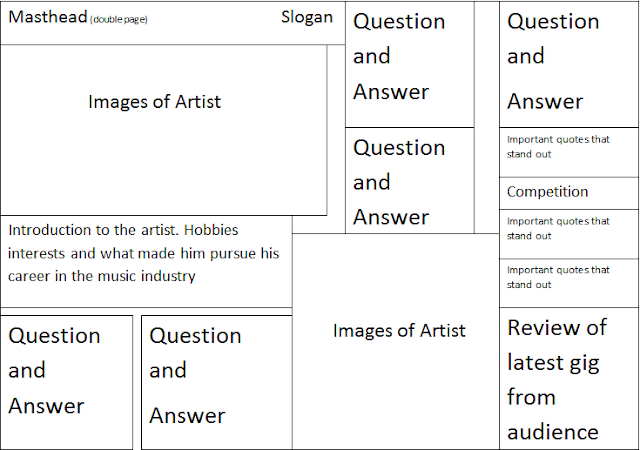
Double Page
On my
double page spread I will cover the main artist I will ensure that on one side
it will be an article purely based on the artist. The article will be based
upon what influenced the artist and his success on his journey through the
music industry. The genre that he focuses on, his reasons for choosing it and
what will be his next steps to further his career.
On the
opposing side, I will have reviews on previous gigs that he has performed, this
way it shows that the audience can relate to the artist reading up on what
other big artists and fellow peers think of his performances. I will also have
a section on it where individuals from the crowds will have their say on what
they felt of that gig and what they may like to see from his next up and coming
performance.
There will
also be photos of the artist at gigs, in the studio and at a photo shoot. These
will help to break up the text and draw attention to other parts of the
articles such as competitions and touring dates which the audience will want to
know, the main thing is that this will be eye catching and each part of the
text will be precise and straight to the point to keep the reader interested
and grasped to the page.
Music Magazine Name Choices
Song name choices! these need to be narrowed down to a choice of 5 so that I am able to select my chosen name of my music magazine.
But what 5?
Subscribe to:
Comments (Atom)


